DRISHIKA MAHAJAN
Menu
Close
99 acres redesign
99 acres redesign
A smart parking mobile application designed to help urban drivers find and
book parking spaces with EV charging support in real time.
Year:
Year:
2024
2024
Category:
Category:
Brand Design
Brand Design
TOOLS USED:
TOOLS USED:
MAYA
MAYA
99 ACRES REDESIGN
A smart parking mobile application designed to help urban drivers find and book parking spaces with EV charging support in real time.
Next Project
Project Overview
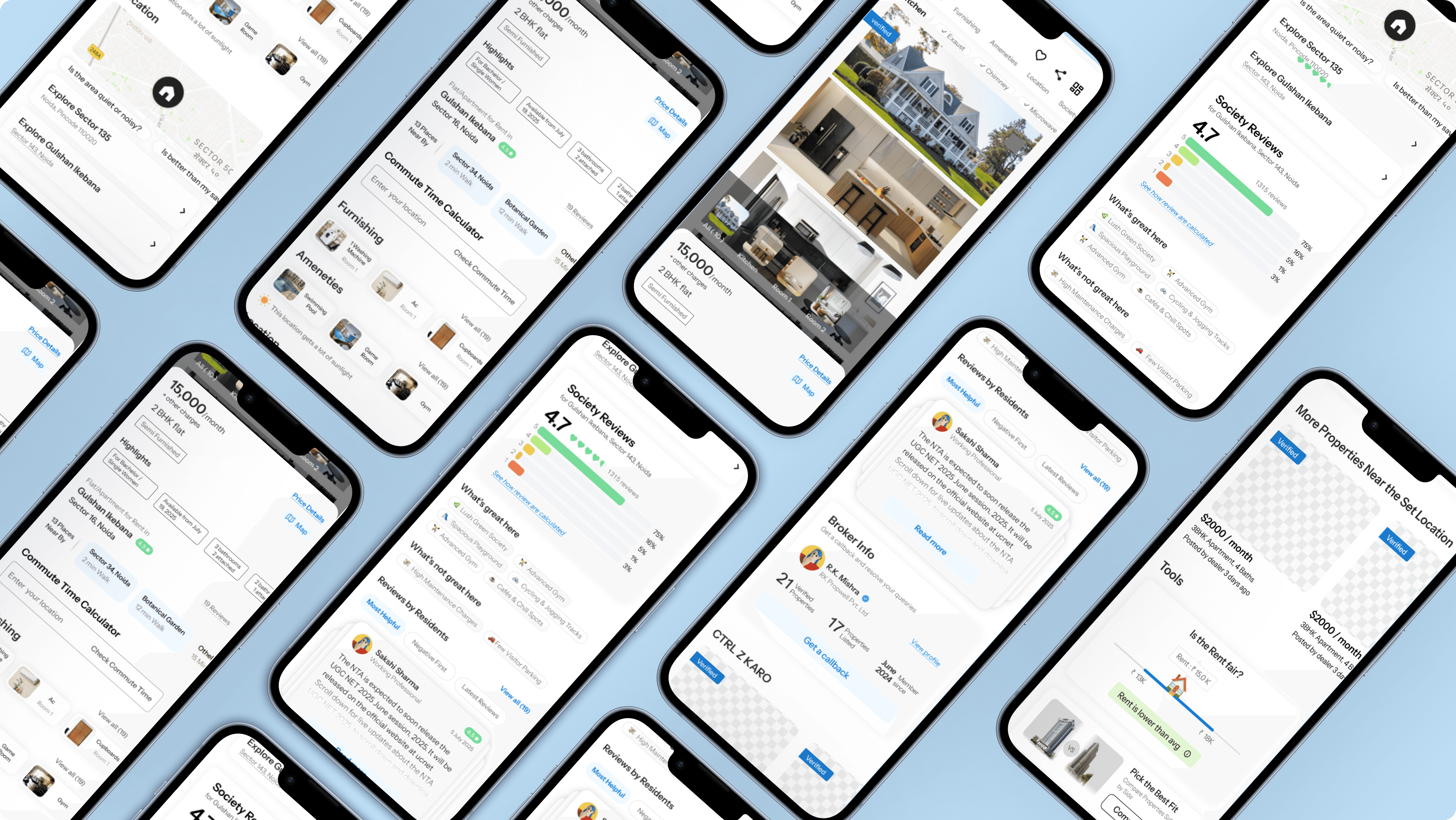
The 99acres Property Detail Page Redesign is a UX/UI project focused on improving how young renters evaluate rental listings on mobile devices. The goal was to redesign the flat details page to make key information easier to scan, increase trust, and help users decide quickly whether a property is worth visiting. I worked on this project as a UX/UI designer, conducting user research, usability testing, and competitive analysis of rental platforms such as Housing.com and MagicBricks. The redesigned solution was developed as a mid-fidelity mobile prototype in Figma.
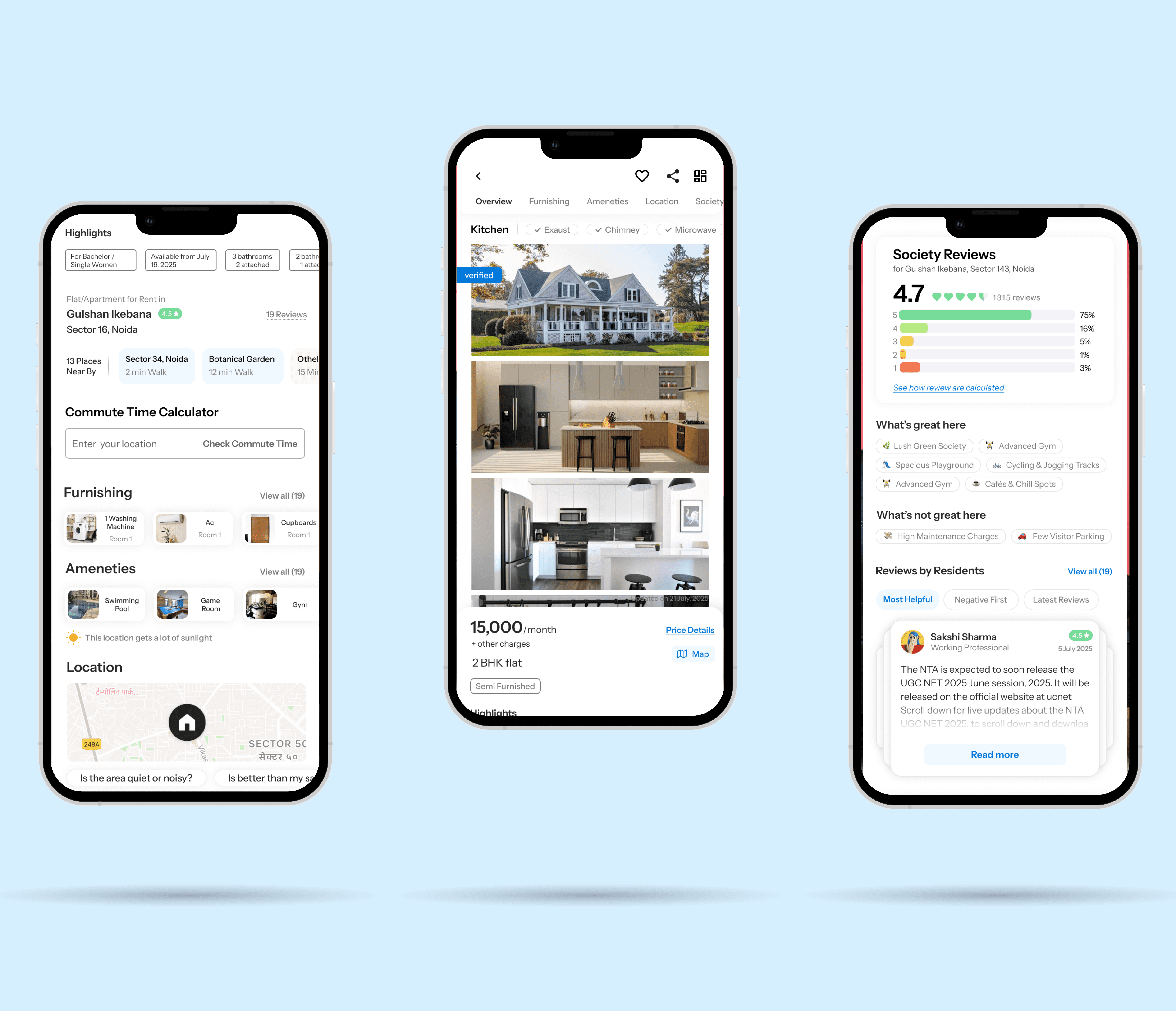
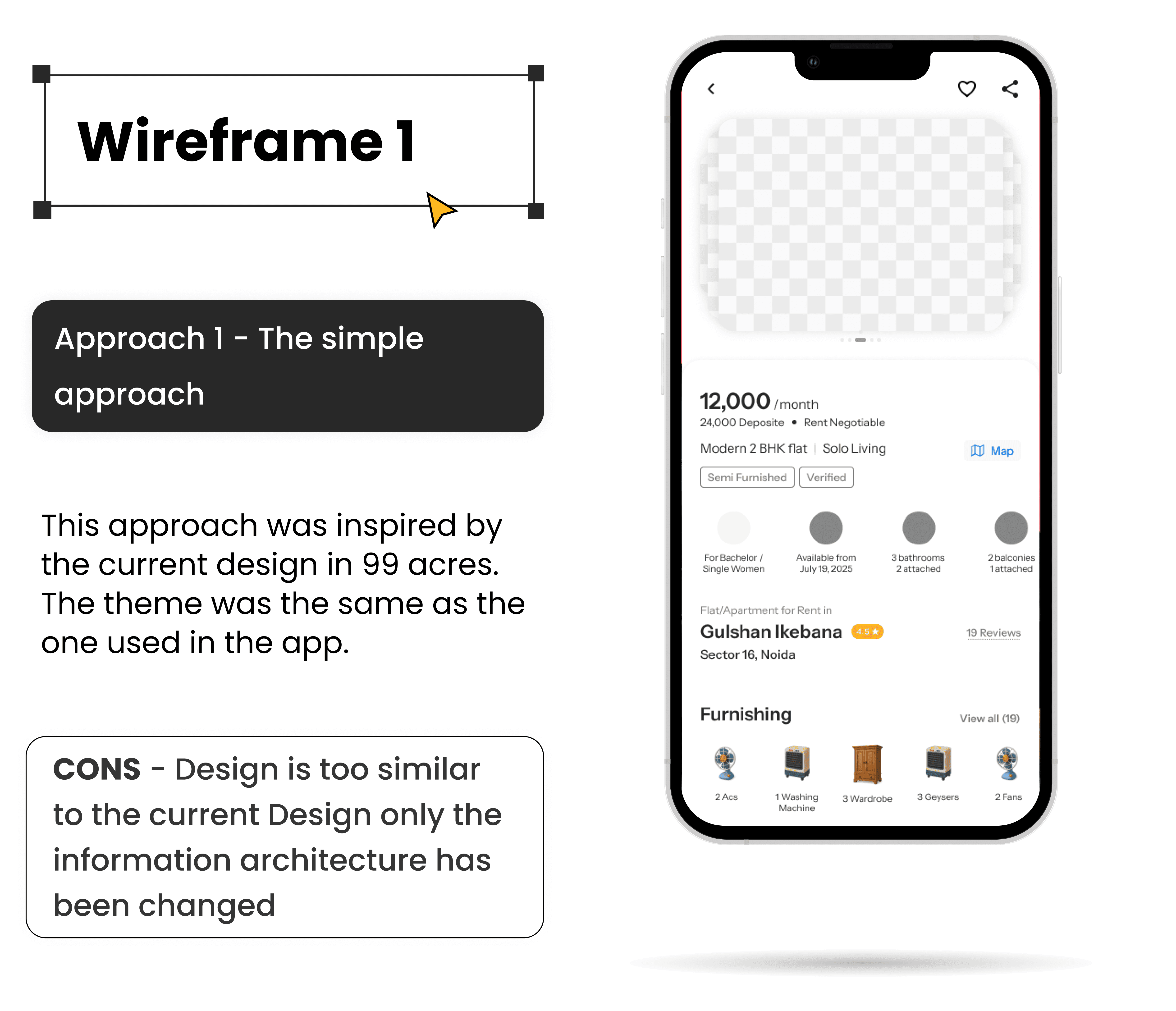
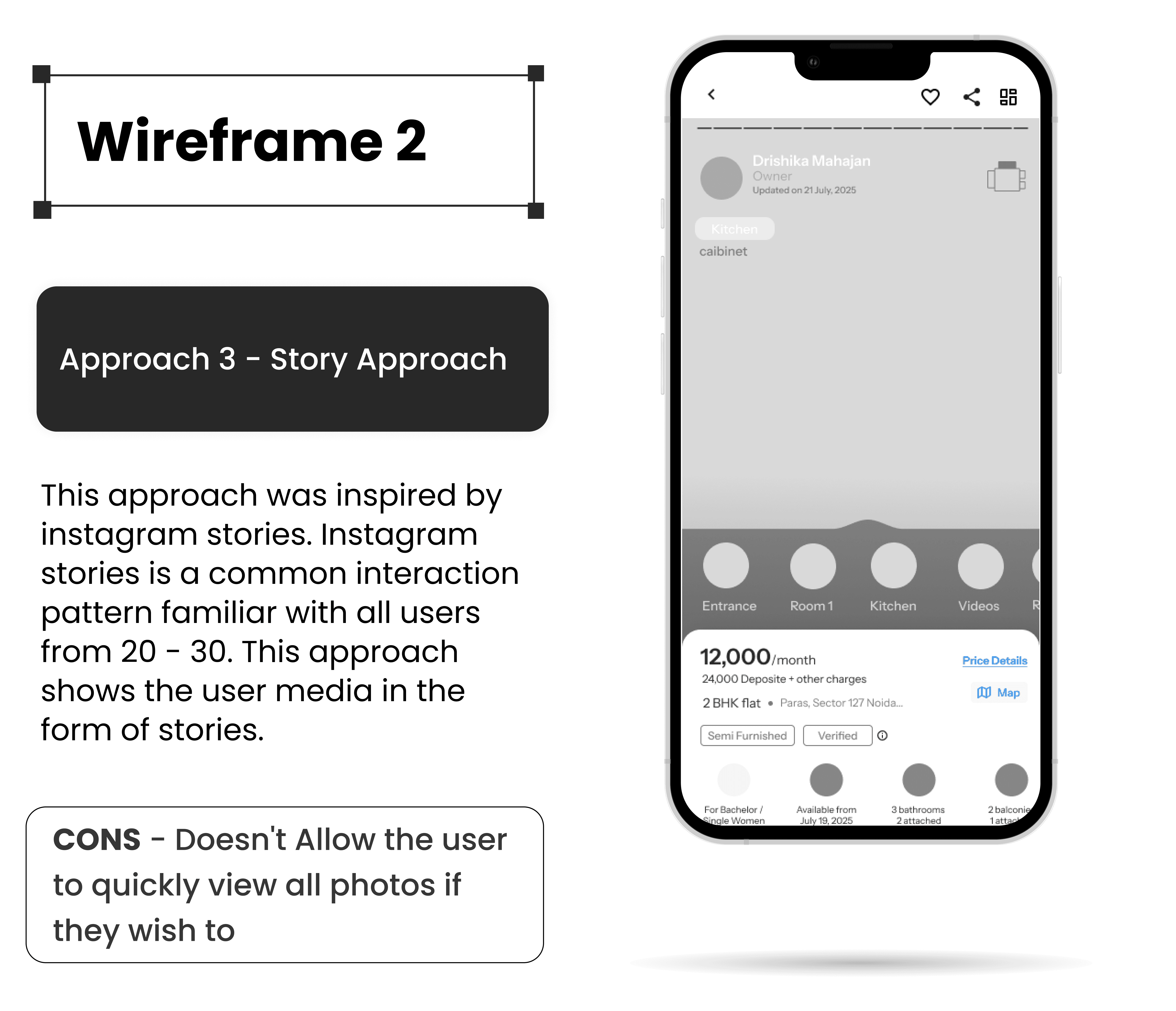
The redesign focused on simplifying the structure of the property details page and reducing cognitive load for mobile users. The layout was reorganized so that critical information such as property photos, pricing, location, and trust indicators appears within the first screen.
Key improvements included introducing a clearer hero section, a transparent rent breakdown, and images to build trust. Amenities and furnishings were reorganized into categorized sections with visual indicators, while progressive disclosure allowed users to expand detailed information only when needed. These changes helped users quickly evaluate listings and make faster, more confident decisions.
Problem statement
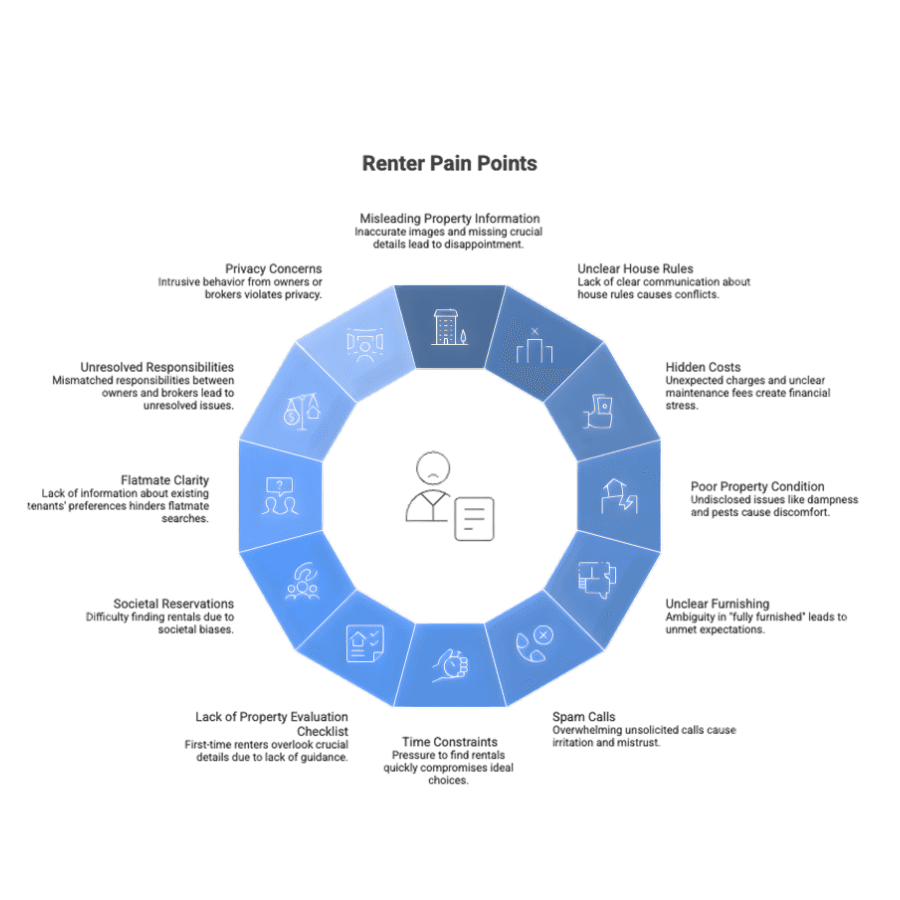
Finding a rental property in Indian cities can be stressful, especially for young professionals relocating for work. While platforms like 99acres provide large numbers of listings, the property details page often presents information in a dense and unstructured format. Important details such as furnishing, house rules, costs, and property condition are either unclear or buried within long sections of text. This makes it difficult for users to quickly evaluate whether a listing meets their needs, leading to confusion, mistrust, and wasted time. Additionally, the lack of clear trust signals and transparency often forces users to rely on external sources or multiple calls with brokers before making a decision.
Research Insights
User interviews and usability testing revealed that renters prioritize trust, transparency, and quick access to essential information. Many users reported that listing photos often did not match the actual condition of the property, which reduced confidence in online listings.
Participants also expressed frustration with hidden costs, unclear furnishing details, and missing information about house rules, safety, and amenities. For most users, high-quality photos, accurate pricing details, and verified listings were key factors influencing whether they would contact a broker or owner.
Design Approach
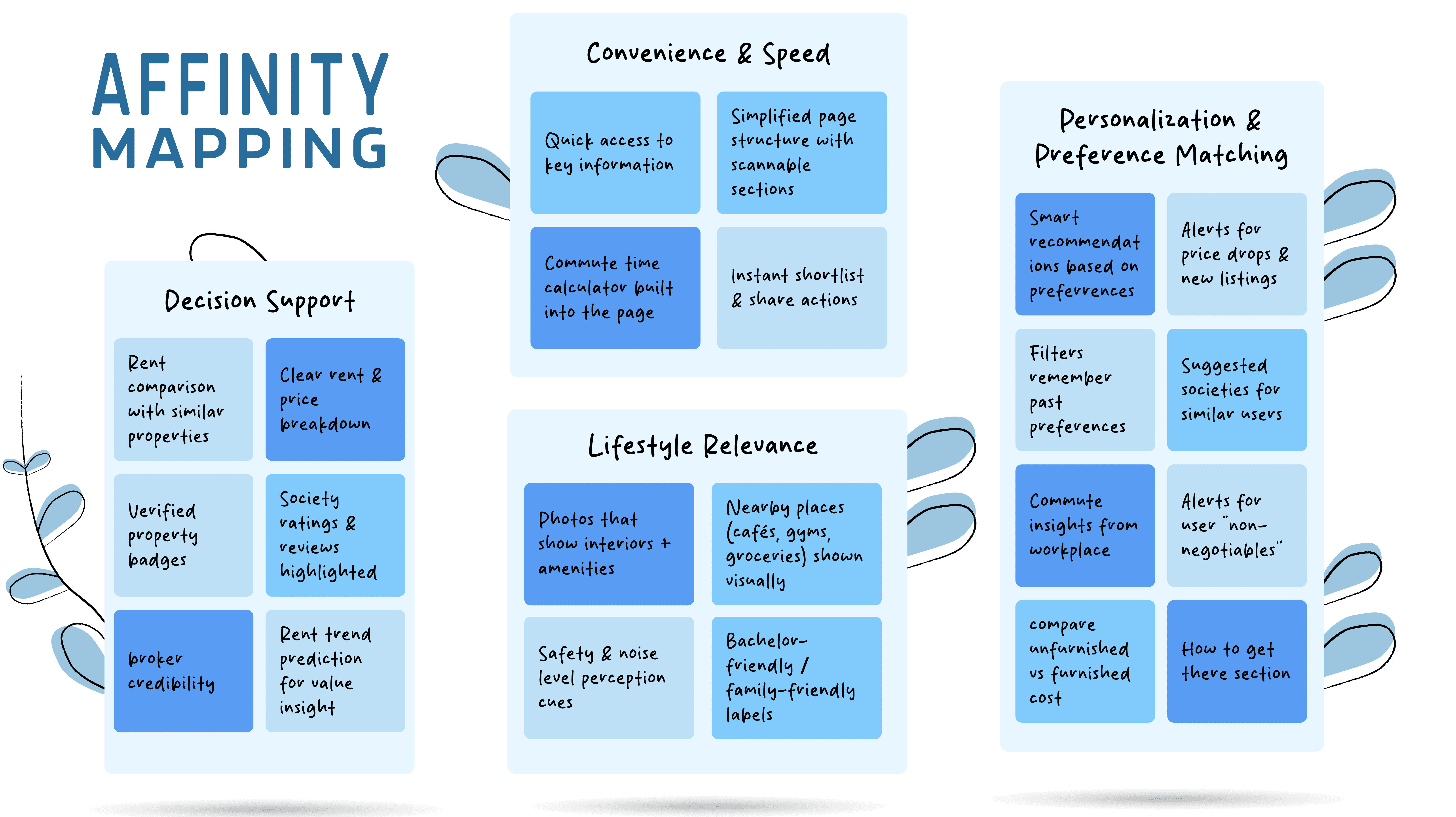
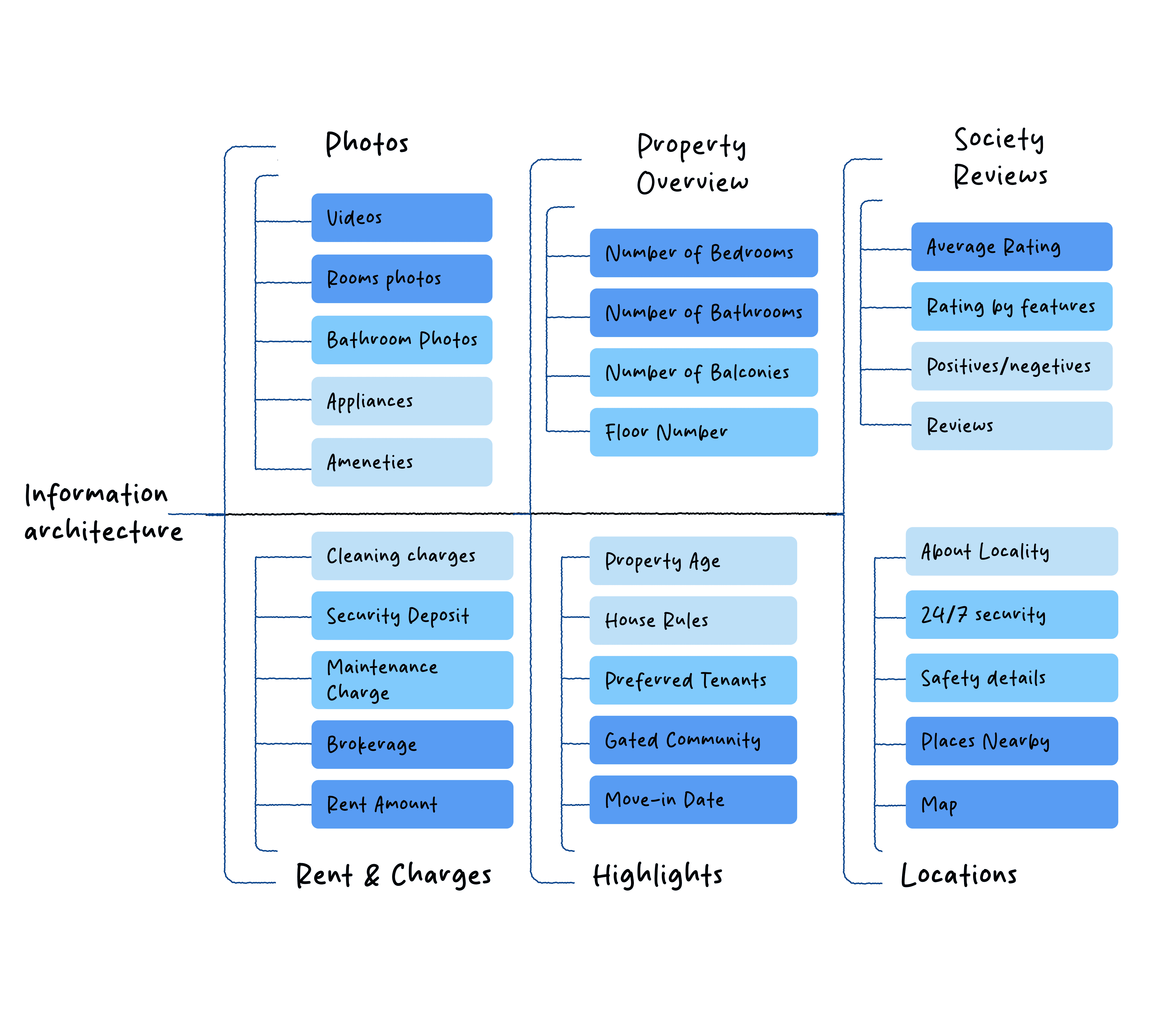
The redesign focused on simplifying the structure of the property details page and reducing cognitive load for mobile users. The layout was reorganized so that critical information such as property photos, pricing, location, and trust indicators appears within the first screen.
Key improvements included introducing a clearer hero section, a transparent rent breakdown, and images to build trust. Amenities and furnishings were reorganized into categorized sections with visual indicators, while progressive disclosure allowed users to expand detailed information only when needed. These changes helped users quickly evaluate listings and make faster, more confident decisions.
Problem statement
Conclusion
Finding a rental property in Indian cities can be stressful, especially for young professionals relocating for work. While platforms like 99acres provide large numbers of listings, the property details page often presents information in a dense and unstructured format. Important details such as furnishing, house rules, costs, and property condition are either unclear or buried within long sections of text. This makes it difficult for users to quickly evaluate whether a listing meets their needs, leading to confusion, mistrust, and wasted time. Additionally, the lack of clear trust signals and transparency often forces users to rely on external sources or multiple calls with brokers before making a decision.
Usability testing showed that users were able to find key information faster and felt more confident about the reliability of listings. The clearer hierarchy of information helped reduce scrolling and improved the overall decision-making experience.The project demonstrates how restructuring content and focusing on renter priorities such as transparency, trust, and mobile usability—can significantly improve the effectiveness of property listing platforms.
Back to Top
Back to Top
Next Project
Project Overview
The 99acres Property Detail Page Redesign is a UX/UI project focused on improving how young renters evaluate rental listings on mobile devices. The goal was to redesign the flat details page to make key information easier to scan, increase trust, and help users decide quickly whether a property is worth visiting. I worked on this project as a UX/UI designer, conducting user research, usability testing, and competitive analysis of rental platforms such as Housing.com and MagicBricks. The redesigned solution was developed as a mid-fidelity mobile prototype in Figma.
Project Overview
The 99acres Property Detail Page Redesign is a UX/UI project focused on improving how young renters evaluate rental listings on mobile devices. The goal was to redesign the flat details page to make key information easier to scan, increase trust, and help users decide quickly whether a property is worth visiting. I worked on this project as a UX/UI designer, conducting user research, usability testing, and competitive analysis of rental platforms such as Housing.com and MagicBricks. The redesigned solution was developed as a mid-fidelity mobile prototype in Figma.
Design Approach
The redesign focused on simplifying the structure of the property details page and reducing cognitive load for mobile users. The layout was reorganized so that critical information such as property photos, pricing, location, and trust indicators appears within the first screen.
Key improvements included introducing a clearer hero section, a transparent rent breakdown, and images to build trust. Amenities and furnishings were reorganized into categorized sections with visual indicators, while progressive disclosure allowed users to expand detailed information only when needed. These changes helped users quickly evaluate listings and make faster, more confident decisions.
Research Insights
User interviews and usability testing revealed that renters prioritize trust, transparency, and quick access to essential information. Many users reported that listing photos often did not match the actual condition of the property, which reduced confidence in online listings.
Participants also expressed frustration with hidden costs, unclear furnishing details, and missing information about house rules, safety, and amenities. For most users, high-quality photos, accurate pricing details, and verified listings were key factors influencing whether they would contact a broker or owner.
Next Project
Conclusion
Usability testing showed that users were able to find key information faster and felt more confident about the reliability of listings. The clearer hierarchy of information helped reduce scrolling and improved the overall decision-making experience.The project demonstrates how restructuring content and focusing on renter priorities such as transparency, trust, and mobile usability—can significantly improve the effectiveness of property listing platforms.
Usability testing showed that users were able to find key information faster and felt more confident about the reliability of listings. The clearer hierarchy of information helped reduce scrolling and improved the overall decision-making experience.The project demonstrates how restructuring content and focusing on renter priorities such as transparency, trust, and mobile usability—can significantly improve the effectiveness of property listing platforms.
Conclusion
Problem Statement
Finding a rental property in Indian cities can be stressful, especially for young professionals relocating for work. While platforms like 99acres provide large numbers of listings, the property details page often presents information in a dense and unstructured format. Important details such as furnishing, house rules, costs, and property condition are either unclear or buried within long sections of text. This makes it difficult for users to quickly evaluate whether a listing meets their needs, leading to confusion, mistrust, and wasted time. Additionally, the lack of clear trust signals and transparency often forces users to rely on external sources or multiple calls with brokers before making a decision.
Design Approach
Research Insights
User interviews and usability testing revealed that renters prioritize trust, transparency, and quick access to essential information. Many users reported that listing photos often did not match the actual condition of the property, which reduced confidence in online listings.
Participants also expressed frustration with hidden costs, unclear furnishing details, and missing information about house rules, safety, and amenities. For most users, high-quality photos, accurate pricing details, and verified listings were key factors influencing whether they would contact a broker or owner.