Drishika mahajan
Menu
Close
CP SIGNAGE
A signage and wayfinding system for Connaught Place designed to simplify navigation and improve user experience in a complex urban layout.
Drishika mahajan
Menu
Close

Project Overview
Problem statement
Goal
Key Design Decision
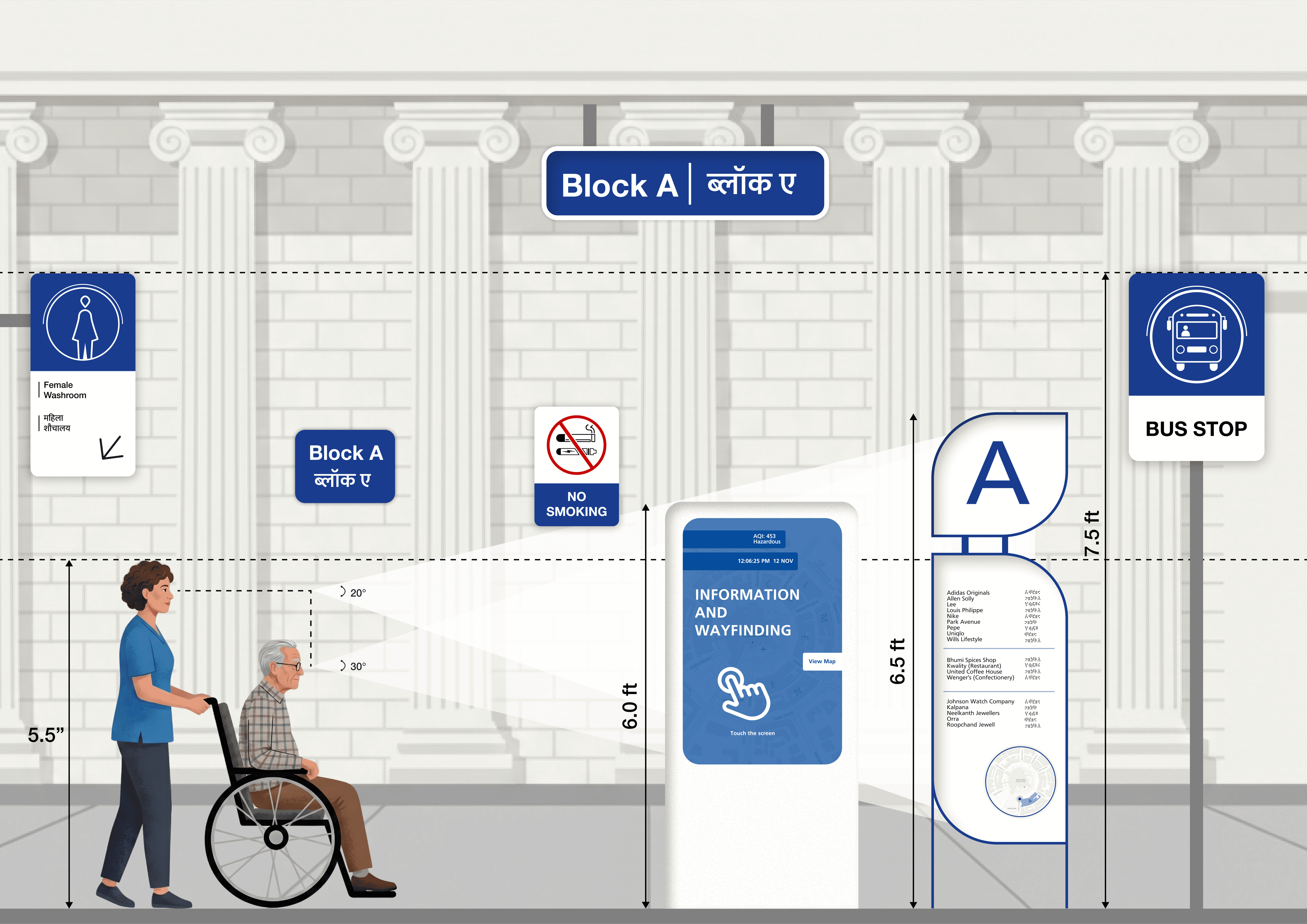
This project focuses on designing a comprehensive signage and wayfinding system for Connaught Place, aimed at improving navigation in one of the city’s busiest commercial hubs. The system helps visitors, tourists, and daily commuters easily understand the circular layout, locate blocks, and reach destinations efficiently. It includes clear directional, informational, and identification signage supported by a consistent visual language. By simplifying navigation and reducing confusion, the design enhances user experience, minimizes wayfinding stress, and creates a more organized and accessible urban environment while respecting the heritage character of the area.
In Connaught Place, visitors often face difficulty navigating the circular layout, identifying blocks, and locating specific destinations, which leads to confusion, wasted time, and overcrowding in certain areas. The absence of a clear and consistent signage system makes it challenging for tourists and first-time users to understand directions, while even regular visitors struggle with orientation across inner and outer circles. There is a lack of an integrated wayfinding system that communicates information effectively. This creates a need for a well-designed signage solution that simplifies navigation and enhances overall user experience.
The goal of this project is to create a smart and user-friendly parking solution that helps drivers easily find and reserve parking spaces in busy urban areas. The app aims to provide a convenient system for booking EV charging parking slots while also allowing homeowners to rent out their unused parking spaces to earn extra income. By connecting drivers with available parking, the platform seeks to reduce the time spent searching for parking, improve convenience, and make better use of existing parking resources.
The design focuses on creating a Simple & efficient experience for both drivers and parking space owners. The app includes three main features: reserving a parking slot, booking an EV charging slot, and renting out private parking spaces. A clean and minimal interface was chosen so users can quickly find available parking, view details, and complete bookings with fewer steps. Location-based search and clear visual icons help users navigate the app easily. The design also considers safety and transparency by allowing hosts to share amenities and security details of their parking spaces. These decisions aim to reduce user effort and provide a smooth and reliable parking experience.
Back to Top
Next Project
Next Project
cp signage
A signage and wayfinding system for Connaught Place designed to simplify
navigation and improve user experience in a complex urban layout.
Project Overview
This project focuses on designing a comprehensive signage and wayfinding system for Connaught Place, aimed at improving navigation in one of the city’s busiest commercial hubs. The system helps visitors, tourists, and daily commuters easily understand the circular layout, locate blocks, and reach destinations efficiently. It includes clear directional, informational, and identification signage supported by a consistent visual language. By simplifying navigation and reducing confusion, the design enhances user experience, minimizes wayfinding stress, and creates a more organized and accessible urban environment while respecting the heritage character of the area.
Problem statement
In Connaught Place, visitors often face difficulty navigating the circular layout, identifying blocks, and locating specific destinations, which leads to confusion, wasted time, and overcrowding in certain areas. The absence of a clear and consistent signage system makes it challenging for tourists and first-time users to understand directions, while even regular visitors struggle with orientation across inner and outer circles. There is a lack of an integrated wayfinding system that communicates information effectively. This creates a need for a well-designed signage solution that simplifies navigation and enhances overall user experience.
Goal
The goal of this project is to create a clear and user-friendly signage system for Connaught Place that helps visitors easily navigate its complex circular layout. The design aims to provide a consistent wayfinding system that improves orientation, identifies blocks efficiently, and guides users to key destinations. By simplifying navigation and reducing confusion, the system seeks to enhance user experience, improve accessibility, and ensure smoother movement across the area while making better use of existing urban infrastructure.
Key Design Decision
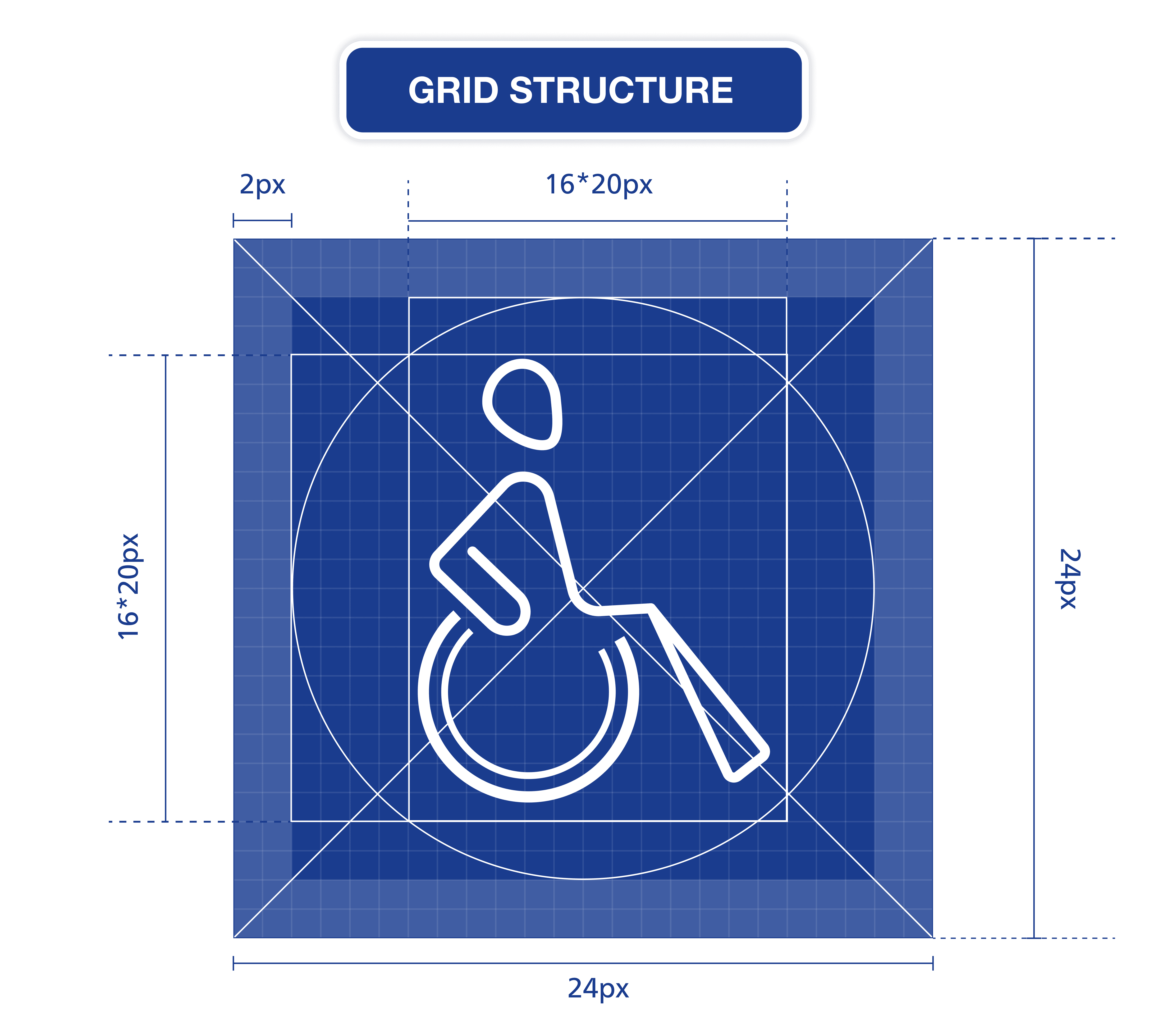
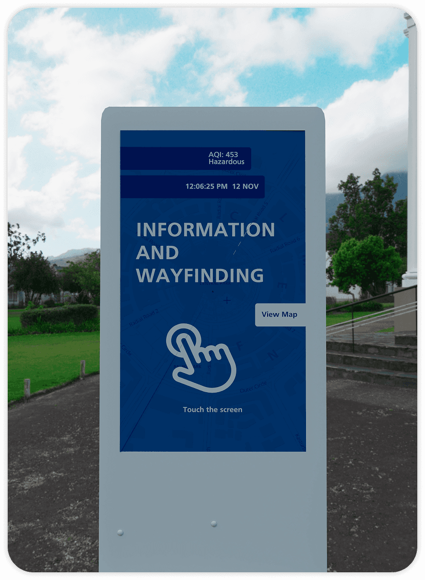
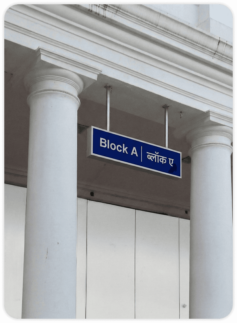
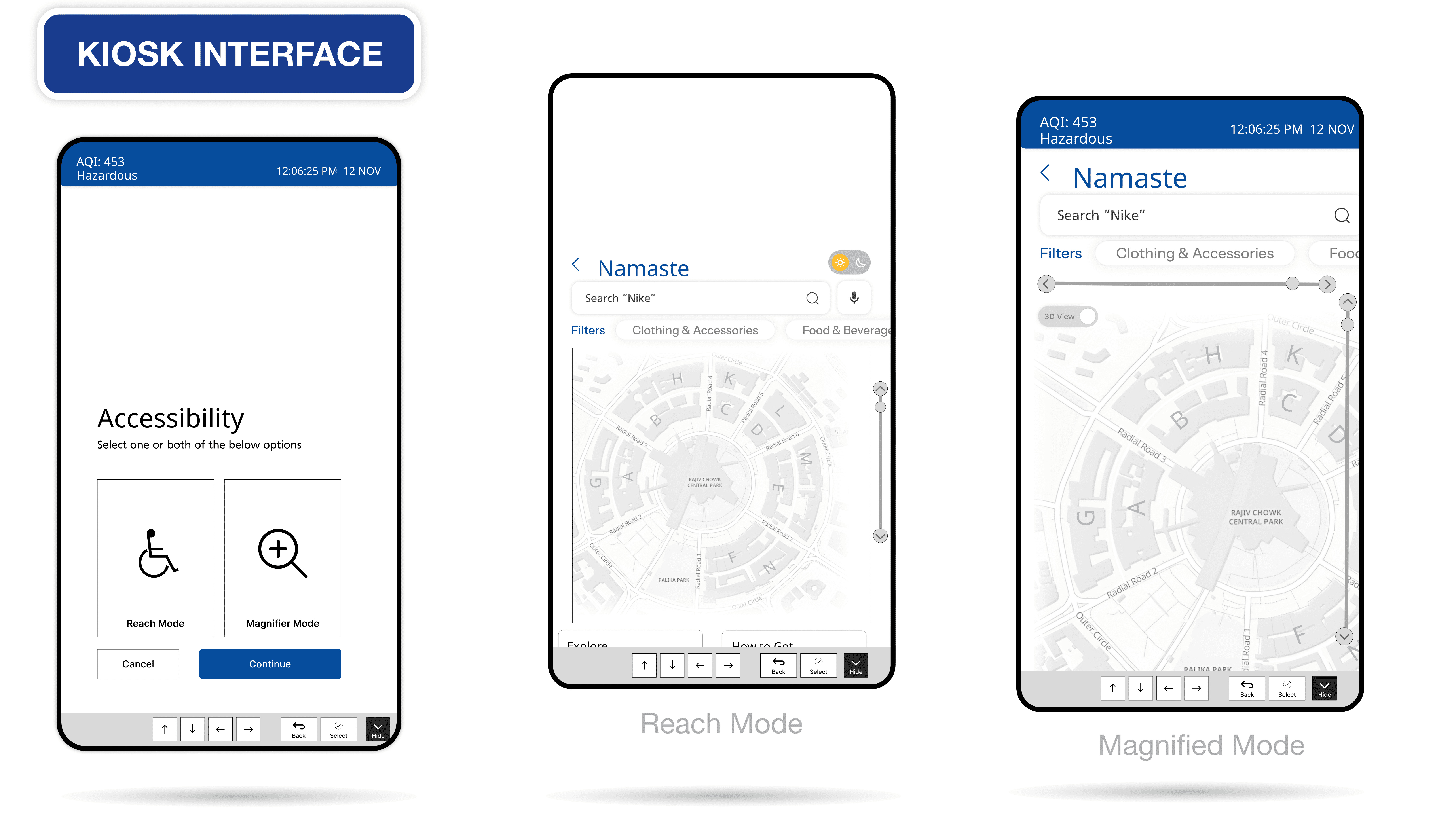
The key design decisions focused on improving clarity, readability, and contextual relevance within Connaught Place. The typeface Helvetica Neue was chosen for its clean, modern form and high legibility, ensuring text remains clear and readable from a distance without visual clutter. Font sizes and weights were carefully balanced to avoid blur and maintain hierarchy across different signage types. The primary color #1A3C8E was selected to create strong contrast against lighter backgrounds, enhancing visibility in busy urban conditions. The design also incorporates the iconic double-circle layout of CP into the signage system, using circular forms and visual cues to represent the inner and outer circles, helping users intuitively understand spatial organization and navigate more effectively.
Back to Top
Next Project
cp signage
A signage and wayfinding system for Connaught Place designed to simplify
navigation and improve user experience in a complex urban layout.
Project Overview
In Connaught Place, visitors often face difficulty navigating the circular layout, identifying blocks, and locating specific destinations, which leads to confusion, wasted time, and overcrowding in certain areas. The absence of a clear and consistent signage system makes it challenging for tourists and first-time users to understand directions, while even regular visitors struggle with orientation across inner and outer circles. There is a lack of an integrated wayfinding system that communicates information effectively. This creates a need for a well-designed signage solution that simplifies navigation and enhances overall user experience.
The key design decisions focused on improving clarity, readability, and contextual relevance within Connaught Place. The typeface Helvetica Neue was chosen for its clean, modern form and high legibility, ensuring text remains clear and readable from a distance without visual clutter. Font sizes and weights were carefully balanced to avoid blur and maintain hierarchy across different signage types. The primary color #1A3C8E was selected to create strong contrast against lighter backgrounds, enhancing visibility in busy urban conditions. The design also incorporates the iconic double-circle layout of CP into the signage system, using circular forms and visual cues to represent the inner and outer circles, helping users intuitively understand spatial organization and navigate more effectively.
The goal of this project is to create a clear and user-friendly signage system for Connaught Place that helps visitors easily navigate its complex circular layout. The design aims to provide a consistent wayfinding system that improves orientation, identifies blocks efficiently, and guides users to key destinations. By simplifying navigation and reducing confusion, the system seeks to enhance user experience, improve accessibility, and ensure smoother movement across the area while making better use of existing urban infrastructure.
This project focuses on designing a comprehensive signage and wayfinding system for Connaught Place, aimed at improving navigation in one of the city’s busiest commercial hubs. The system helps visitors, tourists, and daily commuters easily understand the circular layout, locate blocks, and reach destinations efficiently. It includes clear directional, informational, and identification signage supported by a consistent visual language. By simplifying navigation and reducing confusion, the design enhances user experience, minimizes wayfinding stress, and creates a more organized and accessible urban environment while respecting the heritage character of the area.
Problem statement
Goal
Key Design Decision
Back to Top
Next Project
Next Project
DRISHIKA MAHAJAN
Menu
Close
Conclusion
Project Overview
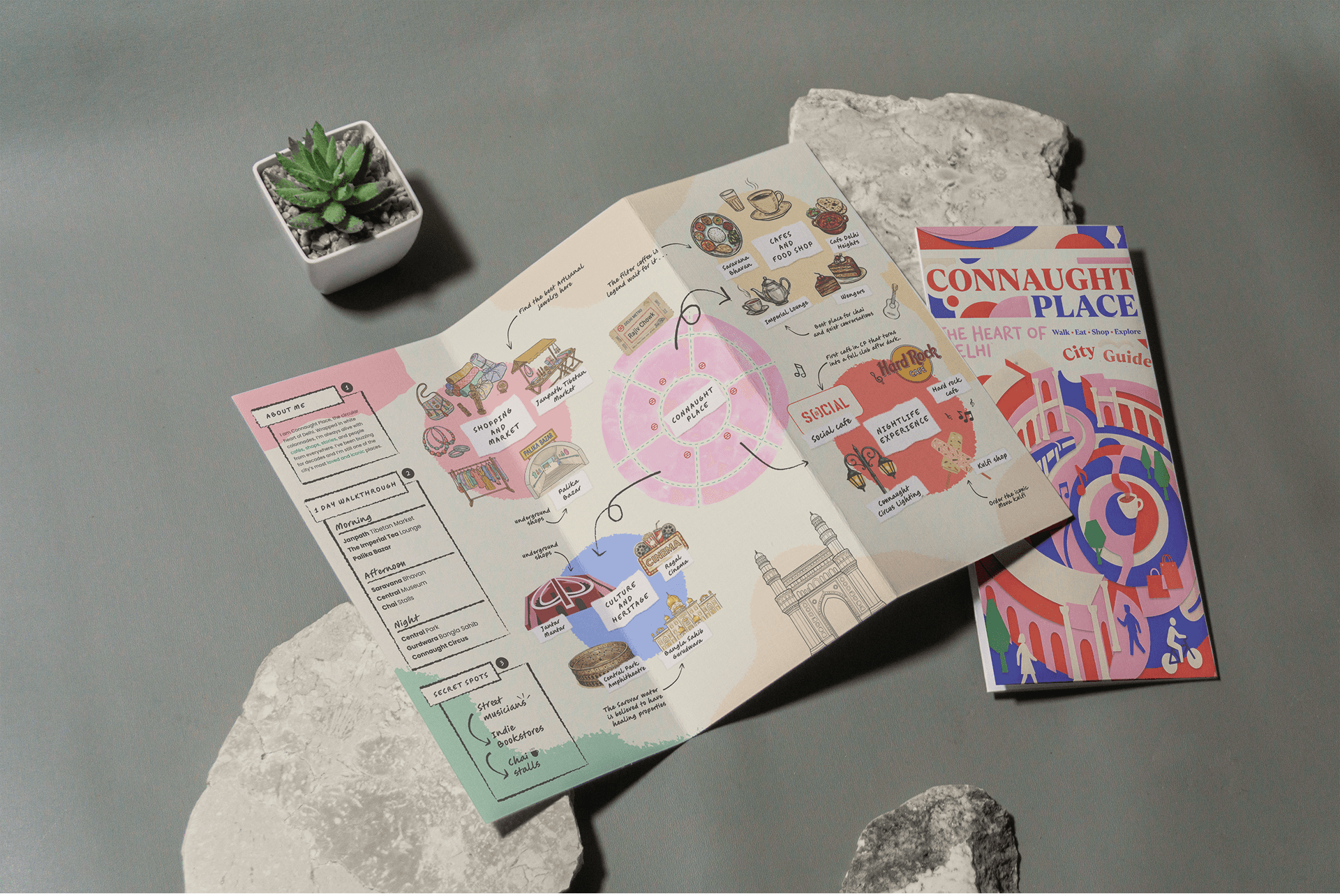
The signage system for Connaught Place successfully addresses the challenges of navigating a complex urban environment by introducing a clear, consistent, and intuitive wayfinding solution. By incorporating the unique concentric layout of the space, the design helps users better understand spatial organization and move efficiently between the inner and outer circles, which are key features of CP’s structure.
The project demonstrates how thoughtful design can enhance user experience in high-density commercial areas by reducing confusion, improving accessibility, and supporting smoother movement. Overall, the system creates a more organized and user-friendly environment while respecting the heritage and urban character of the space, making navigation simpler and more efficient for all users.
Conclusion
Back to Top
Next Project