lENSKART REDESIGN
A signage and wayfinding system for Connaught Place designed to simplify
navigation and improve user experience in a complex urban layout.
Project Overview
Problem statement
Goal
Key Design Decision
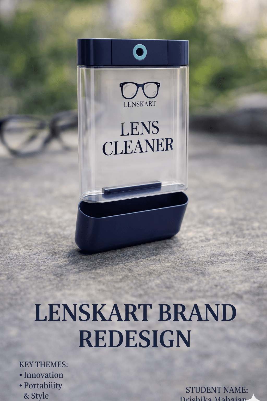
This project focuses on redesigning the lens cleaning solution packaging for Lenskart to improve usability and user experience. The product is used for maintaining eyewear hygiene, but existing solutions often lack clarity, portability, and ease of use. The redesign aims to create a more functional and visually appealing packaging that enhances convenience and usability. By improving the form, structure, and visual communication, the project seeks to deliver a more efficient and user-friendly product experience for everyday use.
In many cases, users face difficulty while browsing and purchasing eyewear on the Lenskart App due to cluttered interfaces, complex navigation, and lack of clear product comparison. The app offers multiple features such as virtual try-on, product filters, and customization options, but users often feel overwhelmed during the selection process. Important information like frame details, pricing, and lens options is not always easy to understand. There is a lack of a smooth and intuitive user journey that guides users efficiently. This creates a need for a redesigned experience that simplifies interaction and improves overall usability.
The goal of this project is to create a clear and user-friendly redesign of the MyGov App that enhances usability and simplifies interaction. The design aims to provide a streamlined interface that improves navigation, organizes information effectively, and highlights key features for better accessibility. By reducing cognitive load and improving clarity, the redesign seeks to enhance user engagement, increase participation in government initiatives, and create a more efficient and seamless digital experience for users.
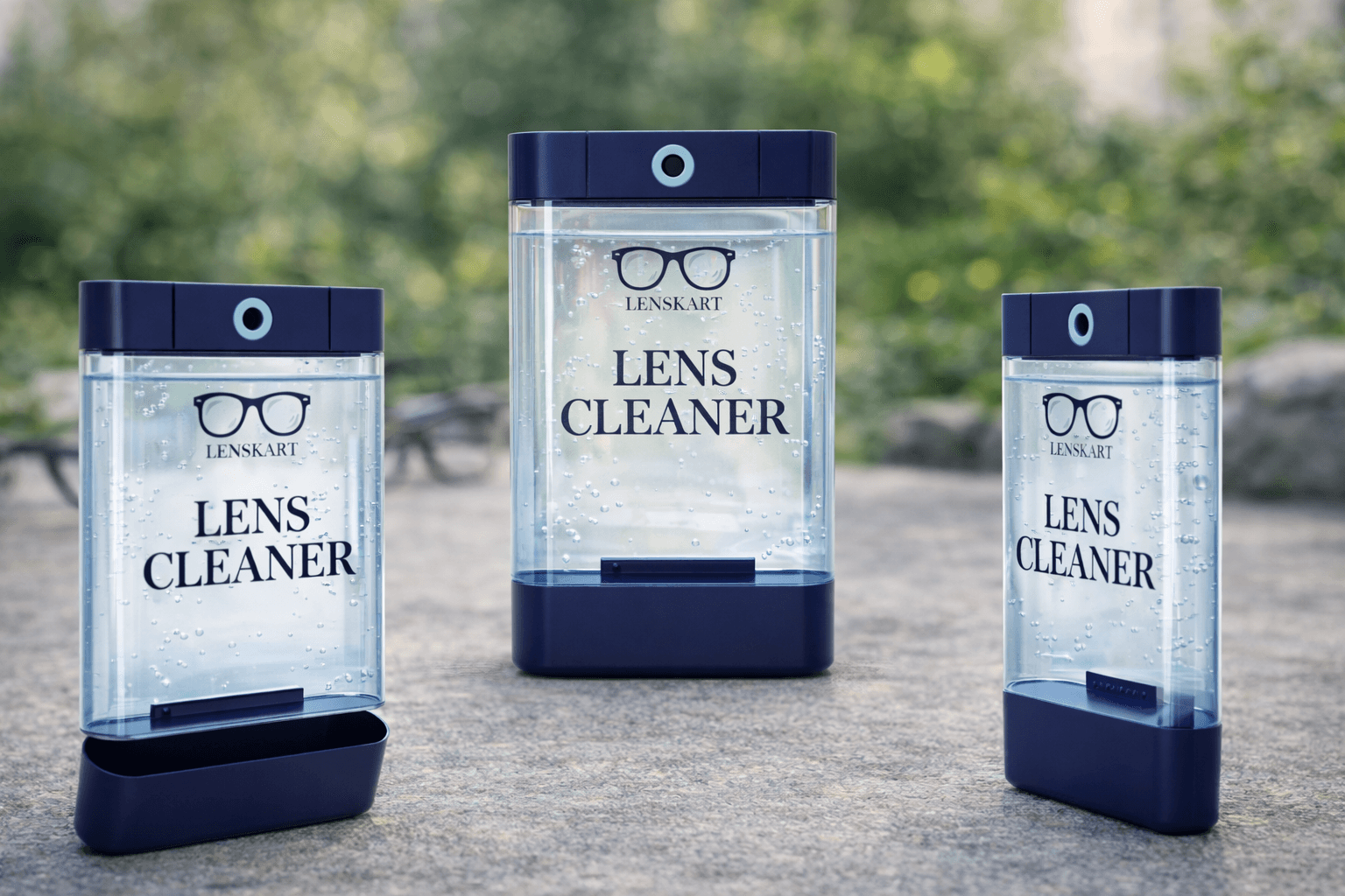
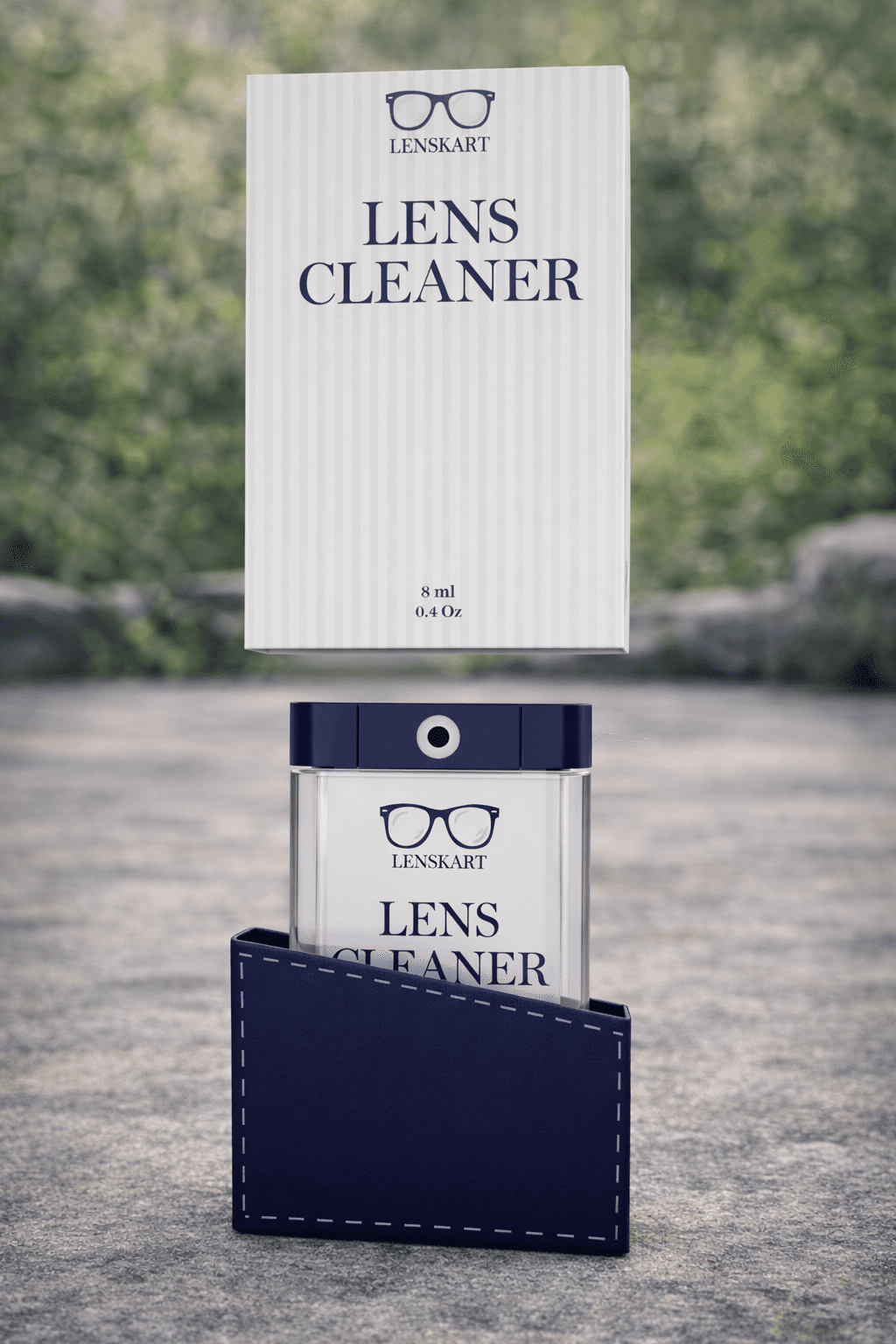
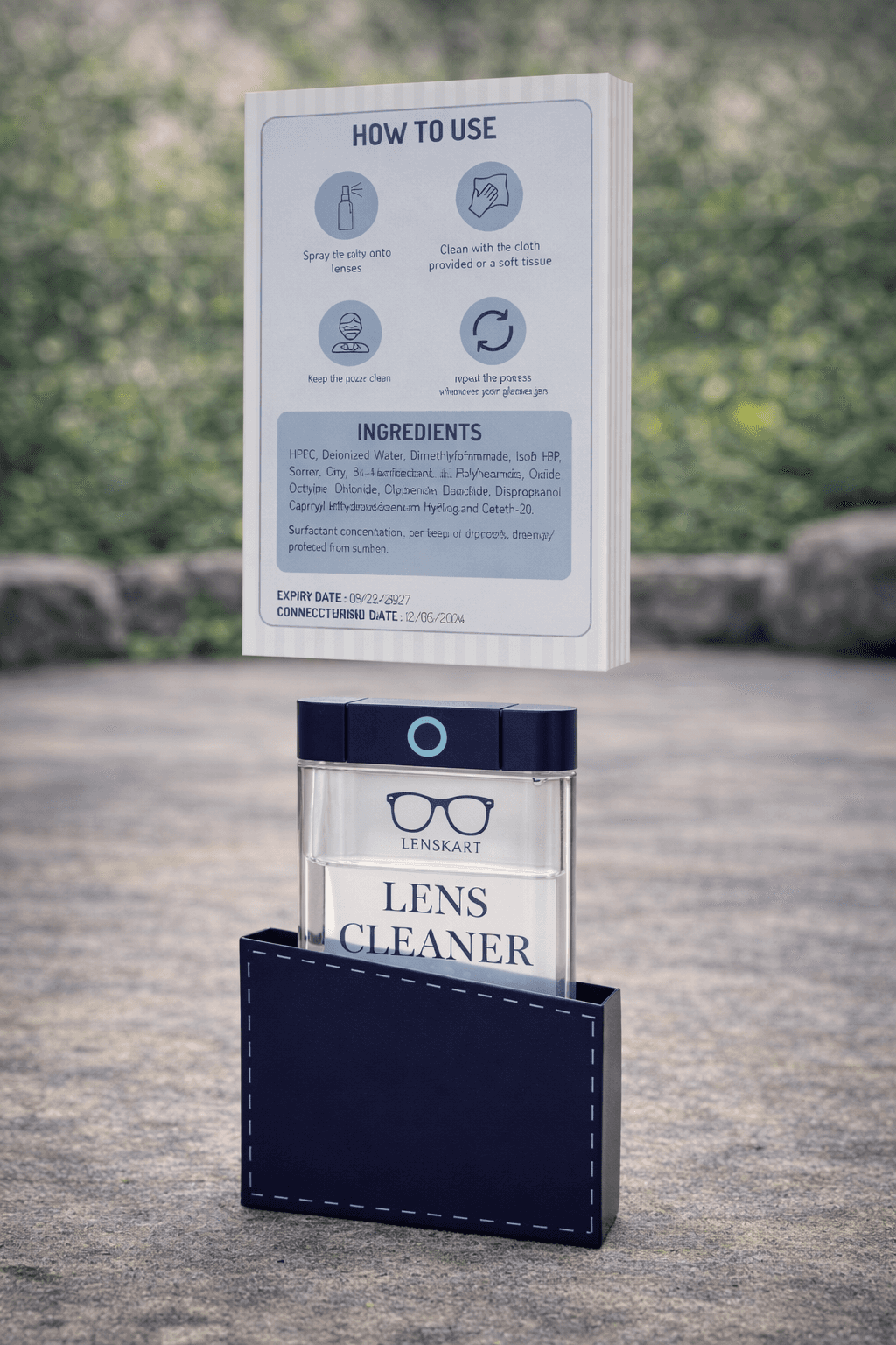
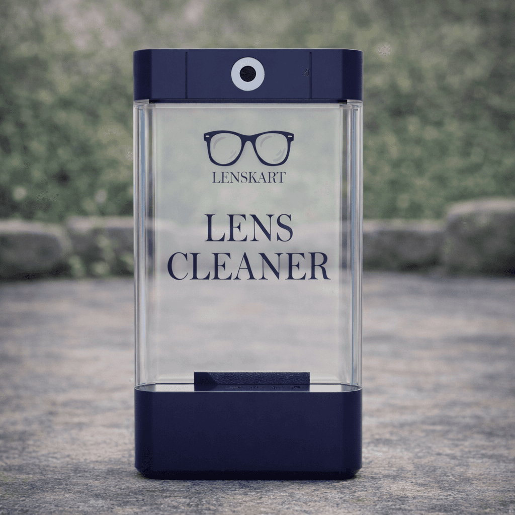
The design focuses on creating a simple and efficient product experience for users of the lens cleaning solution by Lenskart. A compact and ergonomic form was introduced to improve grip and portability. The dispensing mechanism was redesigned to ensure controlled usage and prevent spillage. A clean and minimal visual design was chosen to improve clarity and make product information easy to understand. Thoughtful material selection and form factor enhance usability while maintaining a modern aesthetic, creating a smooth and reliable everyday user experience.
Back to Top
Home
Lenskart redesign
A signage and wayfinding system for Connaught Place designed to simplify navigation and improve user experience in a complex urban layout.
Drishika mahajan
Menu
Close
Project Overview
Problem statement
Goal
Key Design Decision
.This project focuses on redesigning the lens cleaning solution packaging for Lenskart to improve usability and user experience. The product is used for maintaining eyewear hygiene, but existing solutions often lack clarity, portability, and ease of use. The redesign aims to create a more functional and visually appealing packaging that enhances convenience and usability. By improving the form, structure, and visual communication, the project seeks to deliver a more efficient and user-friendly product experience for everyday use.
This project focuses on conducting a cognitive analysis and redesign of the MyGov App to improve usability and user experience. The app allows citizens to participate in governance activities such as discussions, tasks, and campaigns. The redesign aims to simplify navigation, reduce cognitive load, and make information more accessible for users. By improving the interface and interaction flow, the project seeks to create a more intuitive and efficient platform that enhances user engagement and supports better interaction between citizens and government services.
The goal of this project is to create a clear and user-friendly redesign of the MyGov App that enhances usability and simplifies interaction. The design aims to provide a streamlined interface that improves navigation, organizes information effectively, and highlights key features for better accessibility. By reducing cognitive load and improving clarity, the redesign seeks to enhance user engagement, increase participation in government initiatives, and create a more efficient and seamless digital experience for users.
The design focuses on creating a simple and efficient interaction experience for users of the MyGov App. A clean and minimal interface was introduced to reduce clutter and help users focus on important tasks. Clear visual hierarchy and structured layouts were used to organize information and guide users through the app easily. Navigation was simplified by grouping related features and reducing unnecessary steps. Consistent typography, icons, and spacing improve readability and usability, while the redesign emphasizes clarity and ease of use to create a smooth and intuitive user experience.
Back to Top
Home
Drishika mahajan
Menu
Close
LENSKART REDESIGN
A signage and wayfinding system for Connaught Place designed to simplify
navigation and improve user experience in a complex urban layout.
Project Overview
Problem statement
Goal
Key Design Decision
This project focuses on redesigning the lens cleaning solution packaging for Lenskart to improve usability and user experience. The product is used for maintaining eyewear hygiene, but existing solutions often lack clarity, portability, and ease of use. The redesign aims to create a more functional and visually appealing packaging that enhances convenience and usability. By improving the form, structure, and visual communication, the project seeks to deliver a more efficient and user-friendly product experience for everyday use.
In many cases, users face difficulty while browsing and purchasing eyewear on the Lenskart App due to cluttered interfaces, complex navigation, and lack of clear product comparison. The app offers multiple features such as virtual try-on, product filters, and customization options, but users often feel overwhelmed during the selection process. Important information like frame details, pricing, and lens options is not always easy to understand. There is a lack of a smooth and intuitive user journey that guides users efficiently. This creates a need for a redesigned experience that simplifies interaction and improves overall usability.
The goal of this project is to create a clear and user-friendly redesign of the MyGov App that enhances usability and simplifies interaction. The design aims to provide a streamlined interface that improves navigation, organizes information effectively, and highlights key features for better accessibility. By reducing cognitive load and improving clarity, the redesign seeks to enhance user engagement, increase participation in government initiatives, and create a more efficient and seamless digital experience for users.
The design focuses on creating a simple and efficient product experience for users of the lens cleaning solution by Lenskart. A compact and ergonomic form was introduced to improve grip and portability. The dispensing mechanism was redesigned to ensure controlled usage and prevent spillage. A clean and minimal visual design was chosen to improve clarity and make product information easy to understand. Thoughtful material selection and form factor enhance usability while maintaining a modern aesthetic, creating a smooth and reliable everyday user experience.
Back to Top
Home
DRISHIKA MAHAJAN
Menu
Close
Conclusion
The design focuses on creating a simple and efficient interaction experience for users of the MyGov App. A clean and minimal interface was introduced to reduce clutter and help users focus on important tasks. Clear visual hierarchy and structured layouts were used to organize information and guide users through the app easily. Navigation was simplified by grouping related features and reducing unnecessary steps. Consistent typography, icons, and spacing improve readability and usability, while the redesign emphasizes clarity and ease of use to create a smooth and intuitive user experience.
Conclusion
The redesigned lens cleaning solution for Lenskart improves usability by focusing on ergonomics, portability, and ease of use. The new form and dispensing system make the product more efficient and convenient for everyday use. By combining functionality with a clean and minimal design, the project enhances the overall user experience and creates a more practical and user-friendly solution for eyewear maintenance.
Conclusion
The redesigned lens cleaning solution for Lenskart improves usability by focusing on ergonomics, portability, and ease of use. The new form and dispensing system make the product more efficient and convenient for everyday use. By combining functionality with a clean and minimal design, the project enhances the overall user experience and creates a more practical and user-friendly solution for eyewear maintenance.